

Generate images from text descriptions with the text-to-image API. This service, provided by Alibaba Cloud Model Studio, features the Wan, Qwen-Image, and Z-Image model families.
Try it online: Singapore | Beijing
Try it online provides a no-code, web-based text-to-image experience: enter a text description on the page to generate images directly.
Before you begin, get an API key, then set the API key as an environment variable. If you use the DashScope SDK, you must also install the SDK.
The following examples use synchronous calls. The Qwen-Image series also supports asynchronous calls. For Wan series models, see the corresponding API reference.
Parameters:
Parameter:
Parameter: parameters.size (string), in the
Parameter:
Parameter:
Parameter:
Parameter:
If the model call fails and returns an error message, see Error codes for resolution.
Q: How long are image URLs valid? How do I save images permanently?
A: Image URLs expire after 24 hours. You must programmatically download the image immediately and save it to persistent storage, such as a local server or Alibaba Cloud Object Storage Service.
Q: My API call returns a DataInspectionFailed error. How do I resolve this?
A: This error means your input triggered content moderation. Review your prompt or negative_prompt, remove any non-compliant content, and then retry the request.
Q: When should I enable or disable the prompt_extend parameter?
A: Keep it enabled (the default) for concise prompts or for more creative output. Set it explicitly to false when your prompt is already detailed and specialized, or when you are sensitive to API latency.
Note: The wan2.7-image-pro and wan2.7-image models do not support the
- Experience Center: Click a Try it online link above (Singapore, Beijing) to open it. You can select a model, set the output resolution, turn on prompt rewriting, and submit to generate images.
Model performance
Qwen-Image
Complex layout 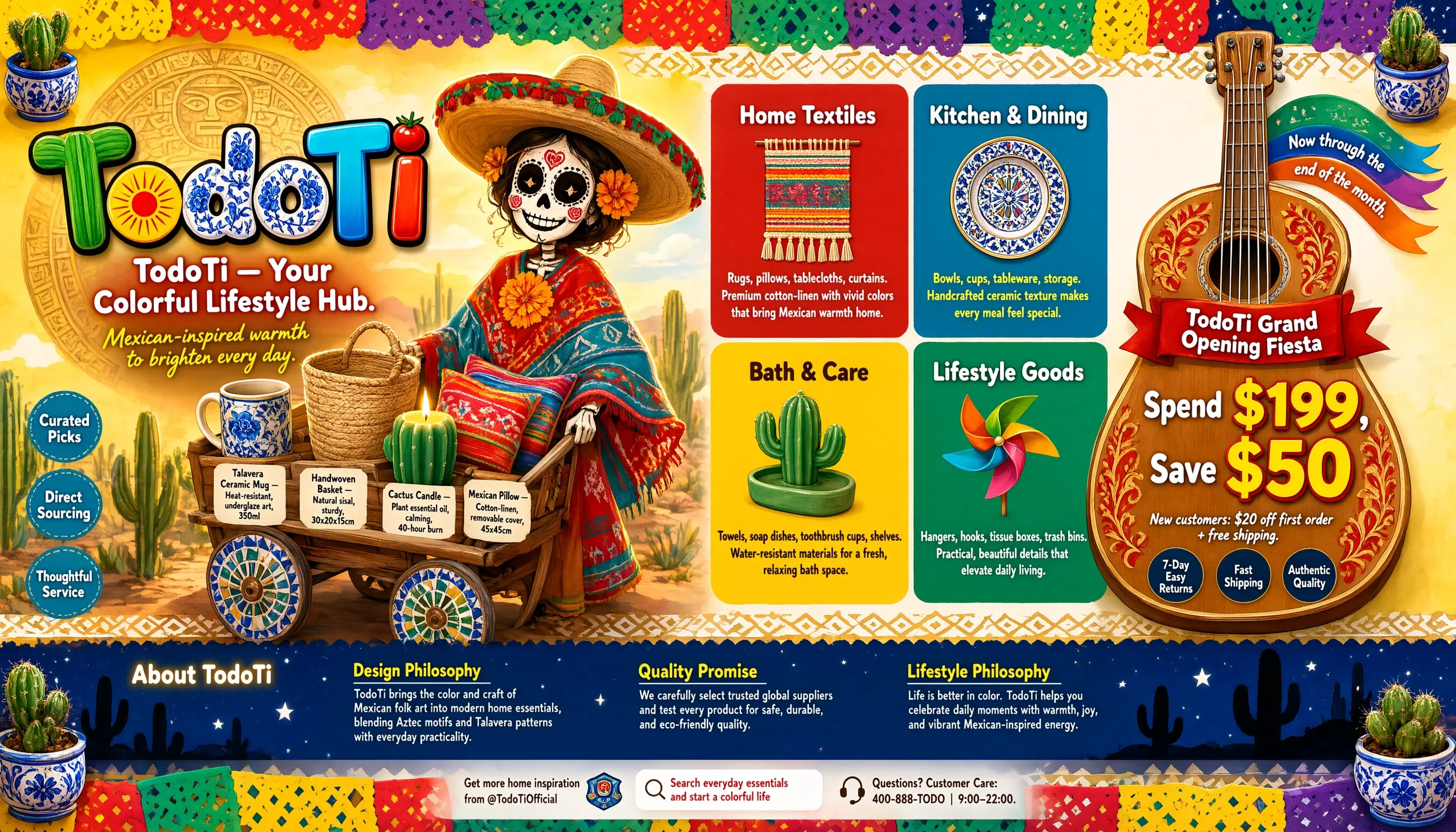 | Long paragraph  | Realistic portrait 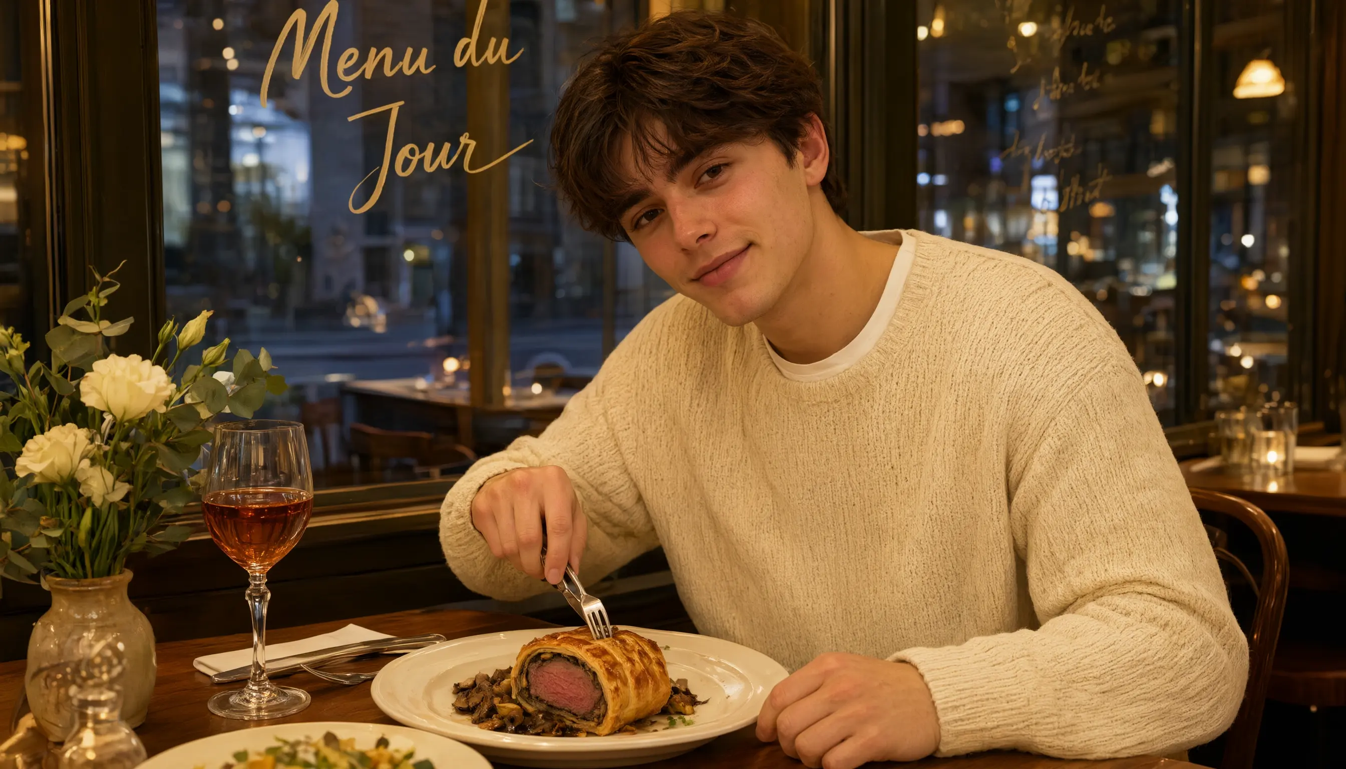 |
UI design 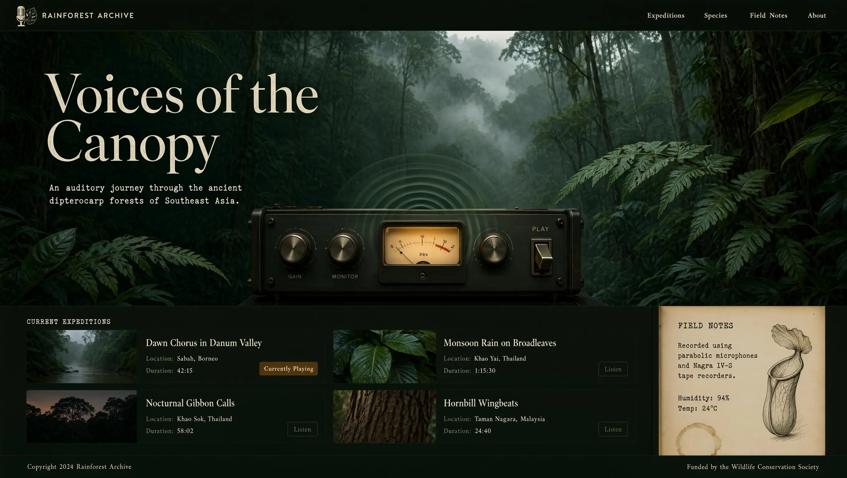 | PPT 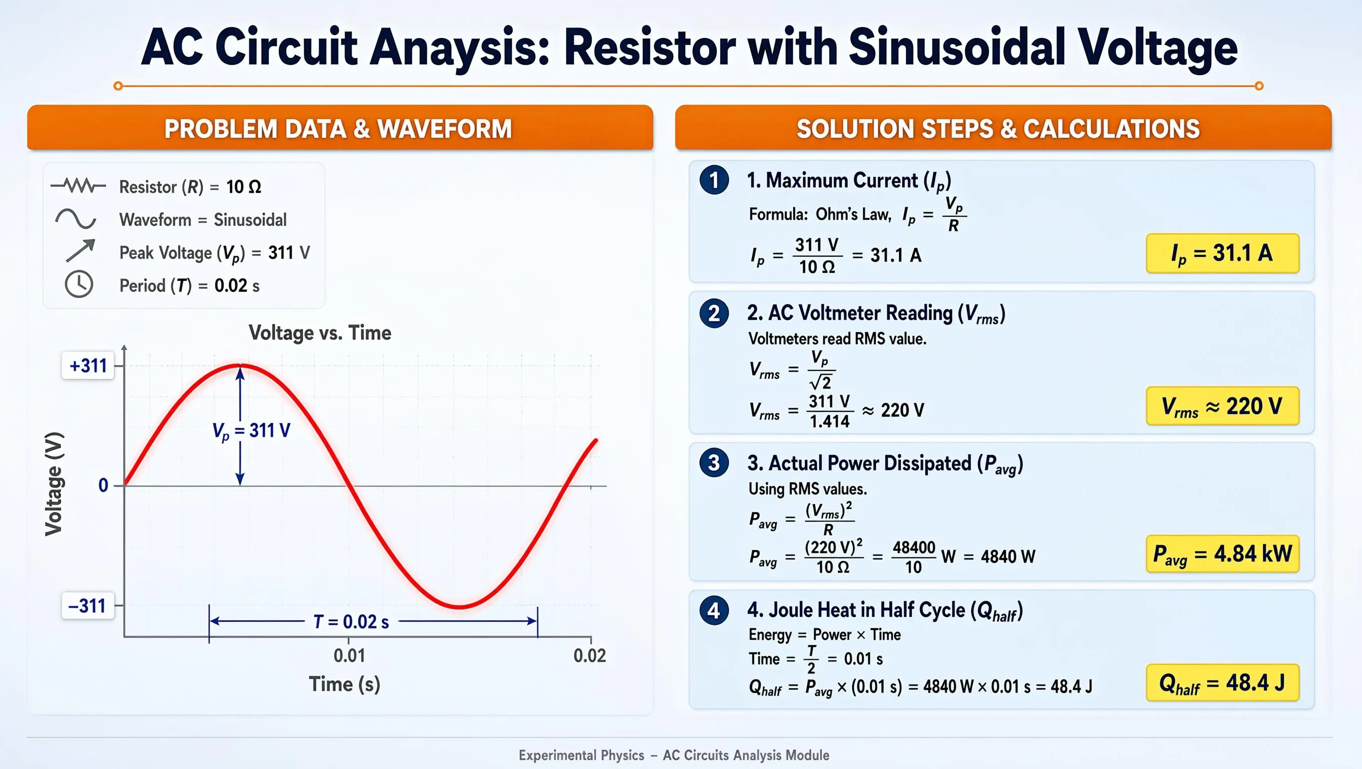 | Illustration design 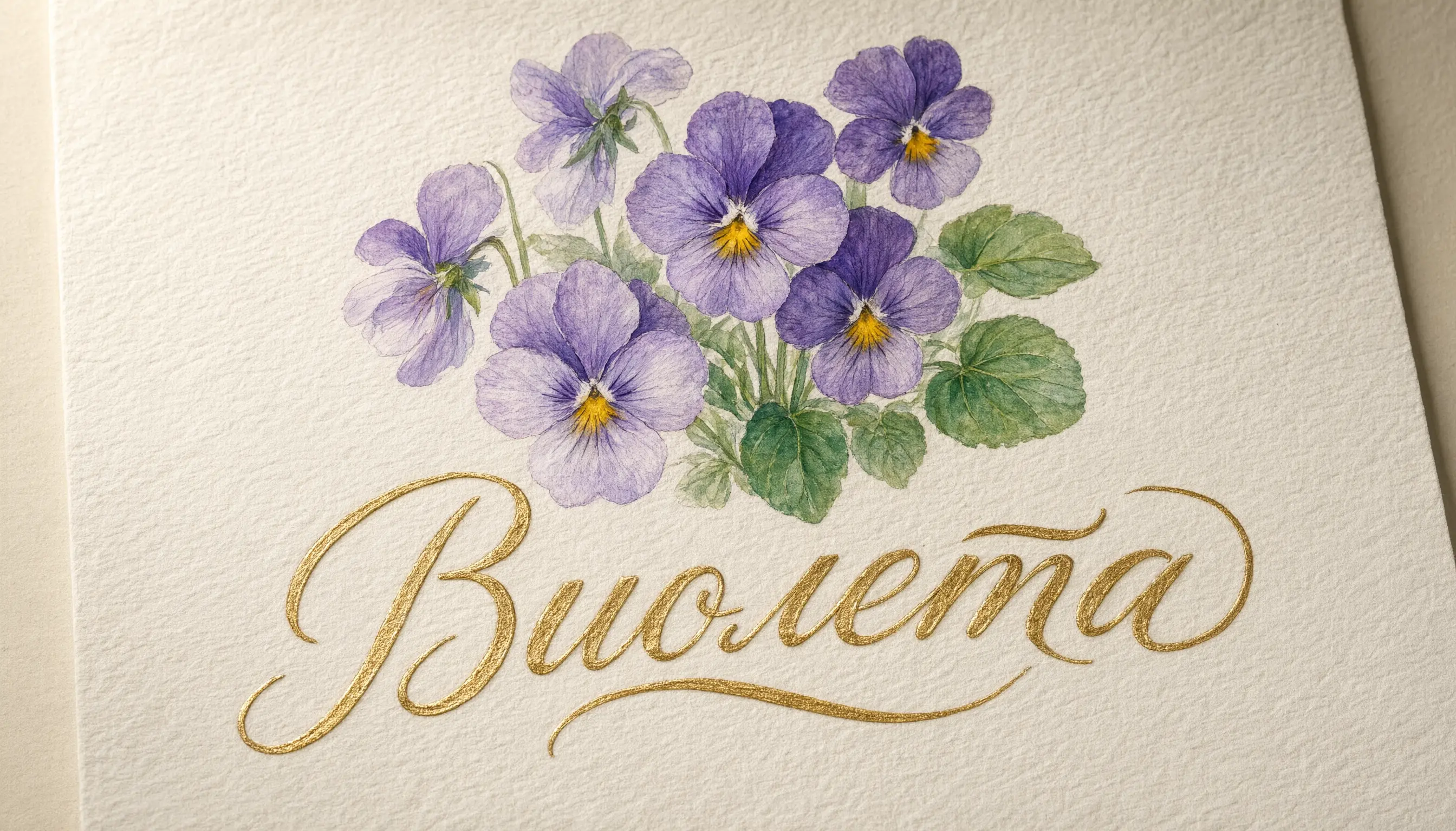 |
Prompts
Prompts
Complex layout: Create a 16:9 wide horizontal e-commerce storefront hero banner infographic for "TodoTi," a Mexican-inspired colorful lifestyle brand. The design should look like a professional online shop header for desktop and tablet, with clear visual hierarchy, festive marketing energy, and readable English typography.Background: vibrant Mexican folk color palette of bright yellow, warm red, peacock blue, and emerald green, blended with soft watercolor washes, subtle handmade paper texture, and fine grain. The top and bottom edges are decorated with traditional papel picado cut-paper banners made of repeating diamonds, triangles, and wave shapes in alternating yellow, red, green, and purple. The papel picado should look light and gently fluttering, with cut-out areas revealing a deep starry-night blue background. Below the top papel picado and above the bottom papel picado, add a continuous Aztec geometric border of stepped lines and diamond motifs in white and antique gold.Four corners: add small 3D decorative Talavera ceramic pots with blue-and-white floral patterns, glossy glaze highlights, and miniature potted cacti with rich green texture and fine spines. These corner elements should balance the composition and add handcrafted detail.Left third: brand identity zone. Feature a large 3D wordmark "TodoTi." The letter "T" extends into two green cactus pads with clear vein texture; the letter "o" contains a red-and-yellow sunburst with sixteen thin rays; the curve of the letter "d" is decorated with blue-and-white Talavera ceramic patterns featuring three peonies and winding vines; the dot of the letter "i" is a glossy red cherry tomato with a white highlight. The wordmark has bold black outlines, high-saturation gradient fills, and a soft drop shadow.Below the wordmark, place the slogan: "TodoTi — Your Colorful Lifestyle Hub." The slogan is in rounded bold white sans-serif with a subtle red glow, centered and highly legible. Below it, add a smaller handwritten-style subtitle in bright yellow: "Mexican-inspired warmth to brighten every day."Behind the wordmark, add a faint semi-circular Aztec sun calendar relief in antique gold and bronze, with fine geometric patterns and a stylized face motif featuring diamond eyes and a rectangular mouth. The relief should glow softly with warm golden light. On the left edge, stack three small circular badges with peacock-blue backgrounds, white text, and stitched dashed borders: "Curated Picks," "Direct Sourcing," and "Thoughtful Service."Center-left: a cheerful Mexican folk-art lifestyle illustration. A cute Catrina skeleton girl wears a wide straw sombrero with red-and-green woven tassels and a colorful embroidered poncho in warm red and peacock blue. Her poncho is decorated with Aztec geometric patterns and blooming marigolds with radiating petals. Her face has elegant Day of the Dead makeup: black heart-shaped eye details with white dashed outlines, red rose cheek motifs, and a warm friendly smile. She pushes a vintage wooden cart with mosaic-tile wheels in blue, white, yellow, and green.The cart is filled with clearly visible everyday products with small clean English labels. Include a Talavera ceramic mug labeled "Talavera Ceramic Mug — Heat-resistant, underglaze art, 350ml"; a handwoven sisal basket labeled "Handwoven Basket — Natural sisal, sturdy, 30x20x15cm"; a green cactus-shaped scented candle with a soft flame labeled "Cactus Candle — Plant essential oil, calming, 40-hour burn"; and colorful Mexican throw pillows labeled "Mexican Pillow — Cotton-linen, removable cover, 45x45cm." The illustration background is a sunny desert oasis with real cacti, soft clouds, warm side-backlight, and a thin golden rim light on the illustrated elements.Center-right: product category navigation in a 2x2 grid of rounded rectangle cards with even spacing, 15px rounded corners, and subtle paper texture. Card 1, red background, title "Home Textiles" in bold white, with a flat icon of a woven wall tapestry with tassels; body text: "Rugs, pillows, tablecloths, curtains. Premium cotton-linen with vivid colors that bring Mexican warmth home." Card 2, peacock-blue background, title "Kitchen & Dining" in bold white, with a Talavera ceramic plate icon; body text in bright yellow: "Bowls, cups, tableware, storage. Handcrafted ceramic texture makes every meal feel special." Card 3, bright yellow background, title "Bath & Care" in bold dark brown, with a cactus-shaped soap dish icon; body text in dark brown: "Towels, soap dishes, toothbrush cups, shelves. Water-resistant materials for a fresh, relaxing bath space." Card 4, emerald-green background, title "Lifestyle Goods" in bold white, with a colorful pinwheel icon; body text in white: "Hangers, hooks, tissue boxes, trash bins. Practical, beautiful details that elevate daily living."Right side: promotional zone shaped like a large Mexican mariachi guitar. The guitar body is warm wood with red-and-gold floral vine carvings, the neck extends upward, and the strings are silvery with a metallic shine. Inside the guitar body, place the main promotion. At the top, add a red ribbon banner with white bold text: "TodoTi Grand Opening Fiesta." Below it, display a large offer: "Spend $199, Save $50," with "Spend" and "Save" in white medium text and the numbers in oversized yellow-and-red 3D type. Below the offer, add smaller handwritten white text: "New customers: $20 off first order + free shipping."At the bottom of the guitar body, place three small circular badges with dark blue backgrounds, white text, and thin gold outlines: "7-Day Easy Returns," "Fast Shipping," and "Authentic Quality." From the guitar neck, let several colorful ribbons flow outward with tilted text: "Now through the end of the month."Bottom area: brand story and culture zone against a deep blue night sky with glowing white five-pointed stars and black cactus silhouettes. On the left, place a title block: "About TodoTi" in bold white with a soft yellow glow. To the right, create three equal columns. Column 1 heading in bright yellow with a white underline: "Design Philosophy"; body in light gray-white: "TodoTi brings the color and craft of Mexican folk art into modern home essentials, blending Aztec motifs and Talavera patterns with everyday practicality." Column 2 heading: "Quality Promise"; body: "We carefully select trusted global suppliers and test every product for safe, durable, and eco-friendly quality." Column 3 heading: "Lifestyle Philosophy"; body: "Life is better in color. TodoTi helps you celebrate daily moments with warmth, joy, and vibrant Mexican-inspired energy."Very bottom: a slim interactive guidance bar above the Aztec border. Use a translucent frosted-white background with a soft blur. Left side: "Get more home inspiration from @TodoTiOfficial" in dark brown, aligned with a small official badge icon. Center: a white rounded search box with a magnifying-glass icon and placeholder text: "Search everyday essentials and start a colorful life" in warm red. Right side: a headset customer-service icon with dark brown text: "Questions? Customer Care: 400-888-TODO | 9:00–22:00."Overall style: vibrant, festive, handcrafted, authentic Mexican-inspired e-commerce banner, modern retail marketing layout, balanced composition, clean information hierarchy, high readability, warm lighting, rich details, professional storefront hero image. All on-image text must be in English only, with no Chinese characters, no misspellings, and clean legible typography.Long paragraph: Vertical Western European 19th-century illustrated poetry page, Romantic maritime farewell theme, international English visual tradition, not an East Asian painting. The composition is a vertical art print or vintage book page with aged ivory paper, fine engraved linework, muted blue-gray watercolor washes, and elegant negative space. The main feature is a long English poem rendered clearly in elegant English copperplate-inspired calligraphy, highly legible, English alphabet only, standard left-to-right reading order, top-to-bottom layout, correct punctuation, exact line breaks, natural ink pressure, dark sepia-black lettering, subtle vintage letterpress texture, refined international typography.Below and around the text, illustrate a cold twilight seashore: gray stones beside the sea, a small boat floating near the shore, distant ships moving toward a haven under low hills, pale evening mist over the water, faint moonlight, soft ripples, a lonely coastal atmosphere, melancholic but restrained. The mood is poetic, timeless, and elegant, like a Victorian English maritime lyric. No Chinese characters, no Chinese painting style, no seals, no stamps, no modern objects, no illegible glyphs, no random letters.Render exactly the following 12 lines from Alfred, Lord Tennyson's public-domain poem "Break, Break, Break"; do not render the title or author name:Break, break, break,
On thy cold gray stones, O Sea!
And I would that my tongue could utter
The thoughts that arise in me.
O well for the fisherman's boy,
That he shouts with his sister at play!
O well for the sailor lad,
That he sings in his boat on the bay!
And the stately ships go on
To their haven under the hill;
But O for the touch of a vanish'd hand,
And the sound of a voice that is still.High resolution, masterful long-form English text rendering, poetic, elegant, museum-quality Western illustrated book page.Realistic portrait: A lifestyle-style male food portrait with a cinematic, on-location feel. The subject is a young man in his early twenties with clean, fresh features, gentle eyes and brows, and naturally clear skin that retains realistic texture detail. He wears a soft, off-white chunky knit sweater over a plain white T-shirt peeking out at the collar, giving off a warm, refined, and relaxed lifestyle vibe. He sits at a cozy Western restaurant table, leaning slightly forward, cutting into a Beef Wellington on his plate with a silver knife and fork in his right hand while his left hand rests naturally on the edge of the table. He tilts his head slightly toward the camera with a faint, relaxed smile and a warm, life-filled gaze. The wooden tabletop is set with an elegant Western meal, alongside a vintage stemmed glass holding an amber-colored drink and a small, delicately arranged vintage flower vase. Behind him is a clear glass wall printed with a light gold, handwritten French menu that reads "Menu du Jour," the text applied to the glass in a silkscreen-like finish with a subtle ambient reflection. The scene is lit with warm yellow overhead interior lighting that softly bathes his face and the food on the table, giving the food an appetizing sheen, while cool ambient light filtering through the glass from outside creates a cinematic contrast between warm and cool tones. The shot is a close, eye-level composition with a slight off-center angle for a natural, breathing feel rather than a stiff, centered framing. A shallow depth of field softly blurs the glass wall and restaurant setting in the background into warm bokeh, with the foreground flowers and drink edges also softly out of focus. The overall tone is warm and comforting, full of everyday atmosphere and mouthwatering appeal.UI design: A widescreen desktop UI design for an immersive website exploring the sounds of an Asian rainforest. The overall mood is dark and tranquil, inspired by vintage field-recording equipment and analog scientific instruments. The color palette centers on deep emerald green, rich obsidian black, and soft earthy brown, creating a calm and serene atmosphere. The interface features subtle mist and haze effects, with soft, dappled light refraction simulating sunlight filtering through a dense canopy, and the background incorporates natural textures such as fine paper grain and leaf veins. The overall image is highly realistic, in a style comparable to a premium BBC nature documentary, with a cinematic composition and extremely fine rendering detail.A minimal, semi-transparent navigation bar spans the very top of the page. On the far left is the brand mark, formed by an intertwined line-art illustration of a vintage analog microphone and monstera leaves, paired with the brand name "RAINFOREST ARCHIVE" in an elegant, soft cream-colored serif font. On the right side of the navigation bar is a menu with four minimal text links in a matching font and color: "Expeditions," "Species," "Field Notes," and "About."The upper two-thirds of the page is the main visual hero banner. The background is an ultra-high-definition, richly atmospheric photo of an ancient Southeast Asian dipterocarp rainforest, wrapped in soft, drifting mist, with blurred dark-green fern fronds in the foreground creating a natural vignette. Overlaid on the left of the banner is the main headline, in a large, high-contrast, elegant serif font: "Voices of the Canopy." Directly below the headline is a smaller, refined subtitle in light cream: "An auditory journey through the ancient dipterocarp forests of Southeast Asia." The text has a subtle typewriter texture, with slightly irregular character spacing that reinforces the vintage, analog-equipment feel.In the lower-middle of the banner is the core audio interaction component: a precision player modeled after a vintage field-recording reel-to-reel deck, inspired by classic Nagra or Marantz tape recorders. The player body is brushed dark gunmetal-gray metal with subtle natural scratches and wear marks, and features two large knurled metal knobs printed with small, clear sans-serif labels: "GAIN" and "MONITOR." At the center of the device is a classic VU meter with a warm, soft amber backlight, its needle resting near the zero mark. To the right of the meter is a heavy-duty physical toggle switch, flipped up to indicate "PLAY" status. While audio is playing, the VU meter emits slowly expanding concentric ripples, resembling gentle water ripples or faint sound waves, in a translucent misty green tone that blends naturally with the hazy background.Below the banner, the page layout shifts to a clean, documentary-style grid used as the sound library section. At the top of this section is an elegant small heading in wide-spaced, all-caps type: "CURRENT EXPEDITIONS." Below the heading is a tidy two-column grid displaying four soundscape cards, each with a distinct style.Card 1 (top left): background is a moody, misty riverbank thumbnail, with the title "Dawn Chorus in Danum Valley," and below it the caption "Location: Sabah, Borneo" and "Duration: 42:15." A small amber badge on the right of the card reads "Currently Playing."Card 2 (top right): a close-up of wet, broad green leaves, with the title "Monsoon Rain on Broadleaves," caption "Location: Khao Yai, Thailand" and "Duration: 1:15:30," and a thin-outlined button labeled "Listen."Card 3 (bottom left): a hazy silhouette of the forest canopy at dusk, with the title "Nocturnal Gibbon Calls," caption "Location: Khao Sok, Thailand" and "Duration: 58:02," and a thin-outlined button labeled "Listen."Card 4 (bottom right): a macro close-up of tree bark texture, with the title "Hornbill Wingbeats," caption "Location: Taman Negara, Malaysia" and "Duration: 24:40," and a thin-outlined button labeled "Listen."On the far right of the soundscape grid, a vertical panel spans the lower half of the section, styled after a page from a vintage field science notebook. The paper has a soft, aged cream texture, with a faint coffee stain in the bottom-right corner. The panel title uses a typewriter monospace font reading "FIELD NOTES," with elegant, slightly faded ink-toned body text: "Recorded using parabolic microphones and Nagra IV-S tape recorders. Humidity: 94% Temp: 24°C." Next to the text is a finely hand-drawn dark brown ink sketch of a pitcher plant.At the very bottom of the page is a minimal footer spanning the full width, with a thin dark green divider line above it. The footer reads "Copyright 2024 Rainforest Archive" on the left and "Funded by the Wildlife Conservation Society" on the right, both in a soft, understated small serif font.PPT: A professional educational PPT slide with a 16:9 aspect ratio. The background is an extremely subtle blue-gray gradient, overlaid with a very low-opacity sine-wave pattern and a faint dot-grid texture, creating a rigorous academic physics atmosphere with a tech-forward feel. Centered at the top of the slide is the main title area, with the text in large, bold, dark navy sans-serif type: "AC Circuit Analysis: Resistor with Sinusoidal Voltage." Directly below the title is a bright thin orange horizontal line as a visual divider, with small circular end caps at both ends to add a sense of ceremony to the layout. The main body of the slide is split into two columns using a strict grid-alignment system, with the left and right columns in roughly a 1:1.2 width ratio, giving the complex formulas on the right ample display space.At the top of the left column is a rounded-rectangle orange header bar with centered bold white text: "PROBLEM DATA & WAVEFORM." The header bar has a subtle drop shadow at the bottom, giving it a slightly raised, three-dimensional feel. Below the orange header is a light gray-white rounded data card with an extremely thin light blue border, containing four vertically arranged data points. Each point has a minimalist, solid-gray line icon to its left — in order, a resistor symbol, a wave line, a voltage arrow, and a clock symbol. The text for the four points is in clear dark gray type, reading in order: "Resistor (R) = 10 Ω," "Waveform = Sinusoidal," "Peak Voltage (V subscript p) = 311 V," and "Period (T) = 0.02 s," neatly laid out with comfortable line spacing, with key numbers highlighted in a slightly darker color.Below the data card is the chart area, with a dark gray chart title centered at the top: "Voltage vs. Time." The chart itself is a 2D coordinate system with light gray gridlines. To the left of the vertical Y-axis is the dark gray label "Voltage (V)," with tick marks labeled "+311," "0," and "-311" in dark blue text on white background boxes. Below the horizontal X-axis is the dark gray label "Time (s)," with tick marks labeled "0.01" and "0.02." At the center of the coordinate system is a smooth, full, slightly glowing bright red sine-wave curve of moderate line weight, showing perfect periodicity. At the peak of the sine wave, a dark blue vertical double-headed arrow indicates the amplitude, labeled in dark blue text: "V subscript p = 311 V." Above one full period on the X-axis is a dark blue horizontal dimension line with vertical lead lines at both ends, labeled in the center in dark blue text: "T = 0.02 s." The chart area has generous white space overall, keeping the visual focus on the red waveform.At the top of the right column is another rounded-rectangle orange header bar, aligned in height with the left header, with centered bold white text: "SOLUTION STEPS & CALCULATIONS." Below the orange header, four light-blue gradient rounded cards are arranged vertically with even spacing between them and generous internal breathing room.The first card has a dark blue circular numbered badge in the top-left corner with a white "1" inside. The card title is bold dark blue text: "1. Maximum Current (I subscript p)." The body below is laid out in three lines in the visual style of standard mathematical notation — with fraction bars, sub/superscripts, and radicals rendered elegantly — reading in dark gray: "Formula: Ohm's Law, I subscript p = V subscript p over R," followed by the calculation "I subscript p = 311 V over 10 Ω = 31.1 A." In the bottom-right corner of the card is a bright yellow rounded highlight box with bold dark blue text: "I subscript p = 31.1 A."The second card's badge shows "2," titled "2. AC Voltmeter Reading (V subscript rms)." The body includes the note "Voltmeters read RMS value," the formula "V subscript rms = V subscript p over square root of 2," and the calculation "V subscript rms = 311 V over 1.414 ≈ 220 V," with the bottom-right highlight box showing "V subscript rms ≈ 220 V."The third card's badge shows "3," titled "3. Actual Power Dissipated (P subscript avg)." The body includes "Using RMS values," the formula "P subscript avg = (V subscript rms) squared over R," the calculation "P subscript avg = (220 V) squared over 10 Ω = 48400 over 10 W = 4840 W," with the bottom-right highlight box showing "P subscript avg = 4.84 kW."The fourth card's badge shows "4," titled "4. Joule Heat in Half Cycle (Q subscript half)." The body includes "Energy = Power × Time," the time calculation "Time = T over 2 = 0.01 s," the main calculation "Q subscript half = P subscript avg × (0.01 s) = 4840 W × 0.01 s = 48.4 J," with the bottom-right highlight box showing "Q subscript half = 48.4 J." All four cards' highlight boxes are aligned uniformly in the bottom-right corner, creating a tidy visual alignment and reading flow.At the very bottom of the slide is an extremely thin light gray horizontal divider, below which is centered small light gray sans-serif text: "Experimental Physics - AC Circuits Analysis Module." The footer area remains minimal, with the rest of the background kept as clean graphics and white space. The slide's overall color system is built around dark navy, bright orange, light blue-gray, and pure white, with the red waveform and yellow highlight boxes as visual accents that break the monotony and add vibrancy and professionalism. All text has sharp edges and extremely high contrast, ensuring clear readability on projectors or screens. Lighting and shadow are handled with restraint, adding depth only through subtle drop shadows beneath the cards and slight highlights on the header bars, resulting in an overall highly polished, clearly structured, and information-rich professional physics teaching slide.Illustration design: A hand-drawn watercolor illustration on soft, off-white watercolor paper. The paper surface shows the characteristics of traditional botanical art, including clearly visible pigment granulation and the soft color bleeding produced by wet-on-wet technique. In the upper-center area of the composition is a cluster of violets and pansies. The petals blend gradients of light purple, deep purple, and lavender, with golden-yellow flower centers. Beside the flowers are small, emerald-green leaves rendered with translucent watercolor washes and finely detailed veins. Soft directional lighting illuminates the scene, highlighting the texture of the watercolor paper and the subtle variations in the pigment. Directly below the floral motif, horizontally centered in the lower half of the paper, is the word "Виолета." The lettering is written in an arched calligraphic script using metallic gold ink. The letterforms are rendered with fluid, continuous strokes and a subtle embossed, three-dimensional quality, giving off a soft metallic sheen under the light.
Wanxiang
Portrait photography  | Photorealistic photography 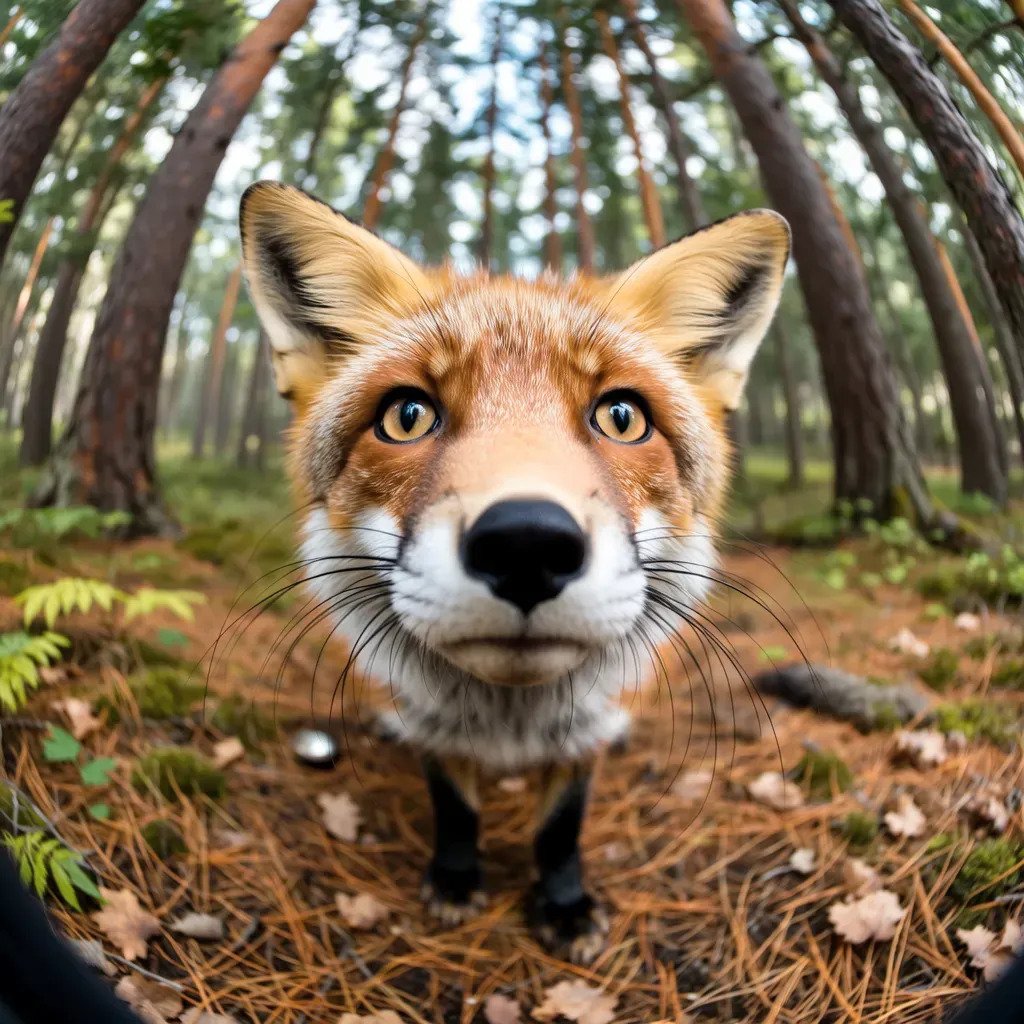 | Artistic styles 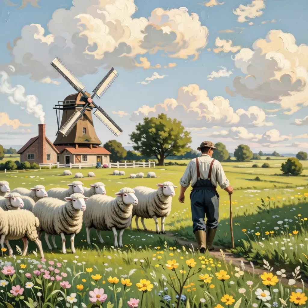 |
Text rendering 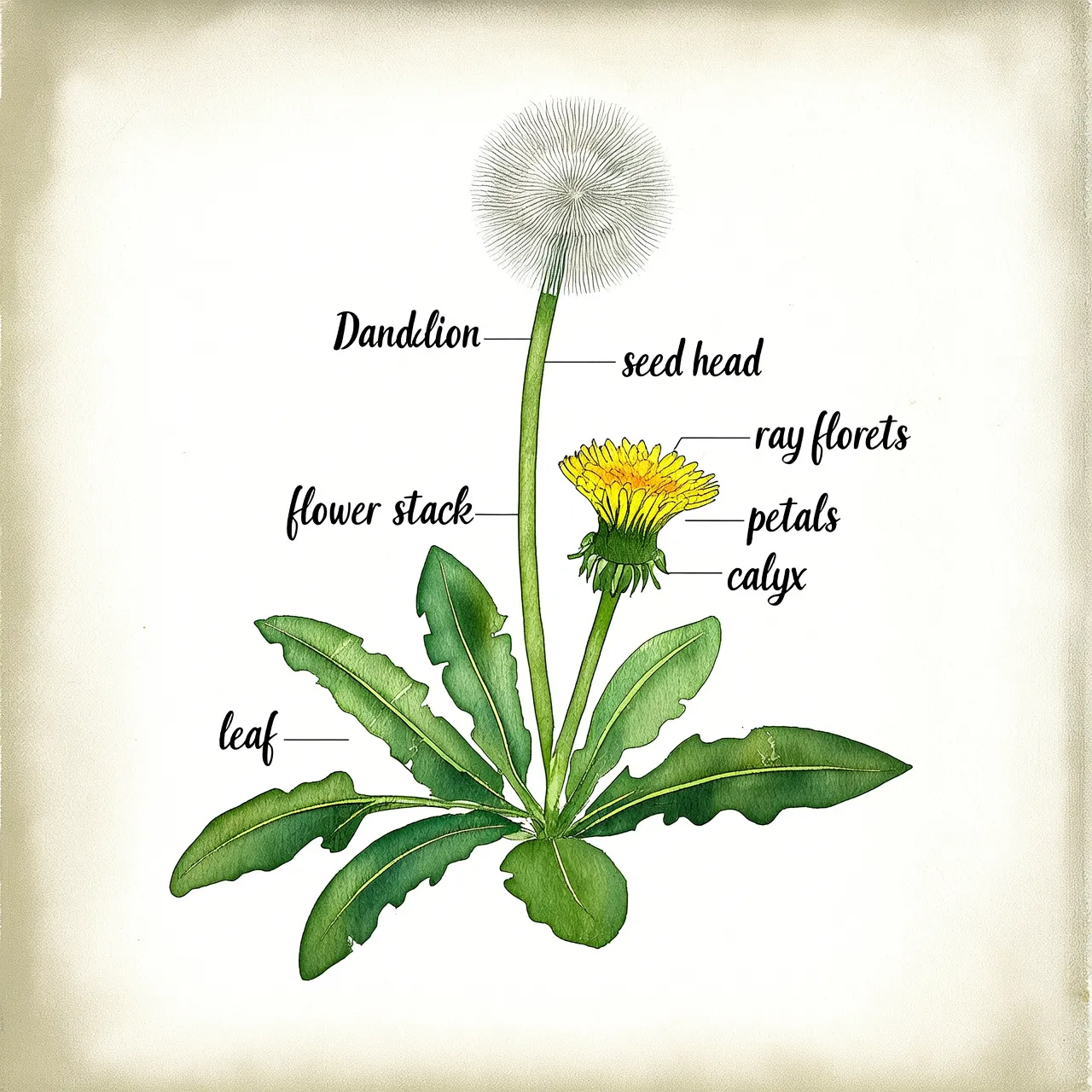 | Poster design 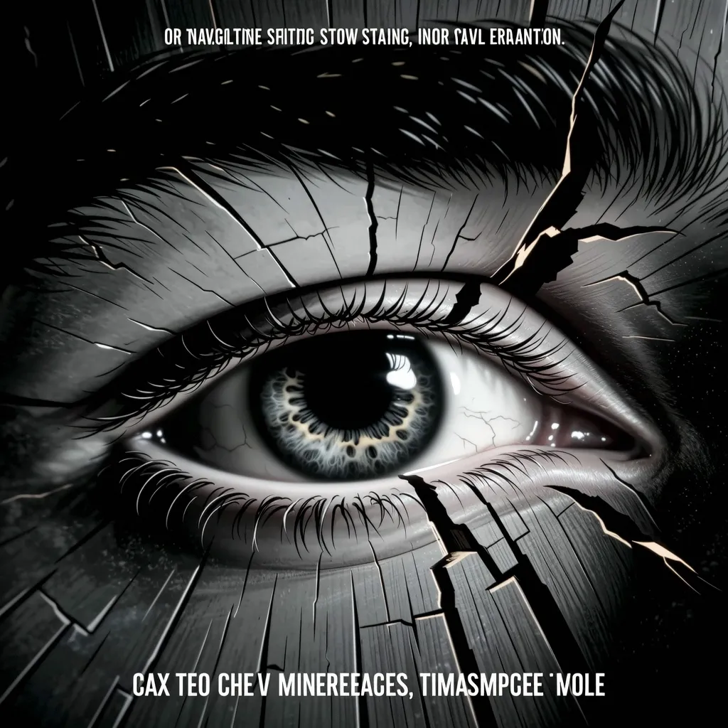 | Image set generation 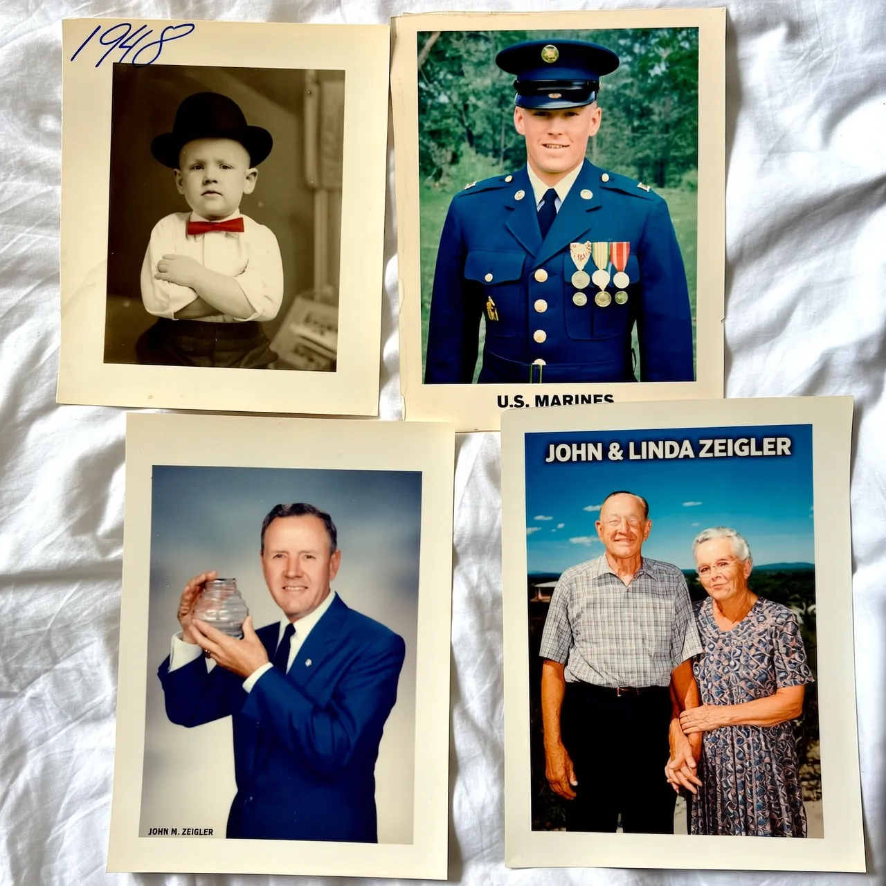 |
View prompt
View prompt
Portrait photography: hyper-realistic Scandinavian woman portrait, flowing platinum blonde hair and piercing blue eyes with prominent freckles, sharp intellectual gaze, Nordic cold-toned directional lighting creating icy atmosphere, minimalist modern styling with clean lines, shallow depth-of-field blurred cold-gradient background, authentic Nordic facial features and porcelain skin texture.Photorealistic photography: fish-eye perspective forest scene with dramatic perspective distortion, ultra-detailed red fox staring into lens with piercing amber eyes, hyper-realistic fur texture showing individual guard hairs and undercoat layers, radially warped trees forming circular background patterns, watercolor painting style with translucent washes and organic pigment bleeding, soft pastel palette of moss green and earth ochre tones, painterly lighting with atmospheric glow through canopy gapsArtistic styles: Vintage oil painting style pastoral scene, a farmer herding sheep across a meadow full of wildflowers, a windmill in the distance turning under blue sky and white clouds, smoke curling from the chimney of a wooden house, bright and soft colors, full of tranquility and comfort.Text rendering: A page from a plant identification guide. Hand-drawn watercolor style. Depicts a dandelion with labeled parts.Poster design: Cinematic poster scene: Extreme macro close-up of eye in wooden crack. Minimalist monochrome, watercolor-CGI fusion, low saturation. Slow push-in with tremor for surreal intensity. Vast negative space, hidden title. Optimized for immersive video generation.Image set generation: A lifetime of memories for an elderly man. Four portraits in different frames: childhood (black-and-white photo), youth (military uniform photo), middle age (work photo in a business suit), and old age (photo with spouse).
Model selection
- qwen-image-3.0-pro: Flagship quality. Supports intelligent prompt rewriting and excels at rendering text that blends naturally with physical materials in both Chinese and English.
- qwen-image-2.1-pro: Best balance of speed, quality, and cost. Supports up to 10 reference images for image-to-image tasks and can automatically output images with transparent channels based on the prompt.
- qwen-image-2.1-turbo: Best cost-effectiveness. The most cost-efficient model in the Qwen-Image series. Supports up to 10 reference images for image-to-image tasks and can automatically output images with transparent channels based on the prompt.
Quick start
Prerequisites
Before you begin, get an API key, then set the API key as an environment variable. If you use the DashScope SDK, you must also install the SDK.
Sample code
The following examples use synchronous calls. The Qwen-Image series also supports asynchronous calls. For Wan series models, see the corresponding API reference.
- Python
- Java
- curl
- dashscope CLI
Key capabilities
1. Prompt following
Parameters: messages.content.text or input.prompt (required), and negative_prompt (optional).
- prompt: Describes the desired content for the image, including the subject, scene, style, lighting, and composition. This is the core parameter for controlling text-to-image generation.
- negative prompt: Describes what to exclude from the image, such as "blurry" or "extra fingers." This parameter helps refine the output quality.
The negative_prompt parameter is not supported by wan2.7-image-pro, wan2.7-image, and qwen-image-2.1 series. To exclude unwanted elements, describe them in the prompt (for example, "do not include xxx").
2. Enable prompt rewriting
Parameter: parameters.prompt_extend (Boolean, defaults to true).
This feature automatically expands and optimizes short prompts to improve image quality. Enabling this feature adds 3 to 5 seconds to the generation time, as a large model is used to rewrite the prompt.
Recommendations:
- Enable this feature for brief or general prompts to significantly improve image quality.
- Disable this feature if you need precise control over image details, have provided a comprehensive prompt, or if response latency is a concern. To disable it, set the
prompt_extendparameter tofalse.
TheParameter:prompt_extendparameter is not supported by wan2.7-image-pro and wan2.7-image. To improve image quality for these models, enablethinking_modeinstead. The qwen-image-3.0 and qwen-image-2.1 series models support theprompt_extendparameter (enabled by default).
parameters.prompt_extend_mode (string, optional, defaults to direct). Supported by the qwen-image-3.0 and qwen-image-2.1 series. Specifies the rewriting method used when prompt_extend is enabled:
direct: Direct Prompt Enhancement (DPE), suitable for most scenarios. Supported for both text-to-image (T2I) and image-to-image/editing (I2I).agent: Agent Prompt Enhancement (APE), provides more refined rewriting. Only supported for text-to-image (T2I). Passingagentfor image-to-image/editing (I2I) returns a 400 error.
3. Set the output image resolution
Parameter: parameters.size (string), in the "width*height" format.
- qwen-image-3.0 series, qwen-image-2.1 series: 512*512 to 2048*2048, aspect ratio 1:8 to 8:1. If not specified, the model auto-recommends a resolution.
- qwen-image-2.0 series: 512*512 to 2048*2048, default 2048*2048.
- wan2.7-image-pro: Supports
1K/2K/4Kshorthands or custom 768*768 to 4096*4096, default 2K. Aspect ratio 1:8 to 8:1. - wan2.7-image: Supports
1K/2Kshorthands or custom 768*768 to 2048*2048, default 2K. Aspect ratio 1:8 to 8:1. - For older Wan models, see the corresponding API reference.
The wan2.7-image-pro model supports 4K resolution and custom resolutions up to 40964096, but only for text-to-image tasks (where no image is input and image set generation is disabled). All other scenarios are limited to 2K resolution (20482048).
Recommended resolutions:
Aspect ratio | 4K (wan2.7-image-pro) | 2K (wan2.7-image, qwen-image-3.0 series, qwen-image-2.1 series, qwen-image-2.0) | 1K (Wan t2i) |
|---|---|---|---|
1:1 | 4096*4096 | 2048*2048 | 1280*1280 |
16:9 | 4096*2304 | 2688*1536 | 1696*960 |
9:16 | 2304*4096 | 1536*2688 | 960*1696 |
4:3 | 4096*3072 | 2368*1728 | 1472*1104 |
3:4 | 3072*4096 | 1728*2368 | 1104*1472 |
4. Image set generation
Parameter: parameters.enable_sequential (Boolean, defaults to false). Supported only by wan2.7-image-pro and wan2.7-image.
Set to true to enable image set generation mode. In this mode, the model uses the prompt and any reference images to generate multiple, story-coherent images from a single request.
- Number of images: Controlled by the
nparameter. When this mode is enabled, this value can range from 1 to 12, with a default of 12. The model determines the actual number of images it generates, which will not exceedn. - Note: When image set generation is enabled, the
thinking_modeandcolor_paletteparameters are unavailable.
5. Thinking mode
Parameter: parameters.thinking_mode (Boolean, defaults to true). Supported only by wan2.7-image-pro and wan2.7-image.
When enabled, the model enhances its reasoning capabilities to improve image quality. This increases the generation time.
Available only when image set generation is disabled (enable_sequential=false).
6. Custom color palette
Parameter: parameters.color_palette (array). Supported only by wan2.7-image-pro and wan2.7-image.
Define the image's color scheme by providing an array of objects, where each object specifies a hex color and its ratio. You must provide 3 to 10 colors (8 is recommended), and the sum of all ratios must equal 100.00%.
Available only when image set generation is disabled (enable_sequential=false).
Click to view an input example
Click to view an input example
7. Other common parameters
Parameter: parameters.n (integer, optional, default: 1). The number of output images. The qwen-image-3.0 and qwen-image-2.1 series support 1 to 6 images; wan2.7-image-pro and wan2.7-image support 1 to 4 images when image set generation is disabled, or specify the maximum number of images (range: 1 to 12, default: 12) when enabled. See "Image set generation" above for details.
The value of n directly affects cost: cost = unit price x number of successfully generated images.Parameter:
parameters.seed (integer, optional, range: [0, 2147483647]). Random seed. If not provided, the service selects one randomly. Using the same seed produces relatively stable results. For specific support, see the API reference for each model.
Parameter: parameters.watermark (bool, optional, default: false). Whether to add a watermark. The watermark appears in the bottom-right corner of the image and reads "AI-generated".
Production deployment
-
Fault tolerance
- Handling rate limiting: When the API returns the
Throttlingerror code or the HTTP 429 status code, rate limiting has been triggered. To handle rate limiting, see Rate Limiting. - Polling for asynchronous tasks: When polling for the result of an asynchronous task, implement a reasonable polling strategy to avoid triggering rate limiting. For example, poll every 3 seconds for the first 30 seconds, then increase the polling interval. Set a final timeout for the task (e.g., 2 minutes). If the task times out, mark it as failed.
- Handling rate limiting: When the API returns the
-
Risk prevention
- Persist results: The API's image URLs are valid for 24 hours. Your production system must download the image immediately after receiving the URL and transfer it to your own persistent storage service, such as Alibaba Cloud Object Storage Service (OSS).
- Content moderation: All
promptandnegative_promptinputs are subject to content moderation. If the input is non-compliant, the request is blocked and aDataInspectionFailederror is returned. - Copyright and compliance risks of generated content: Ensure that your prompts comply with all applicable laws and regulations. Generating content that includes brand trademarks, celebrity likenesses, or copyrighted intellectual property (IP) may pose infringement risks. You are responsible for evaluating and bearing all associated risks.
API reference
- Qwen - Image Generation and Editing
- Qwen-Image
- Wan2.7 - image generation and editing
- Wan2.6 - image generation and editing
- Wan - text-to-image v2
- Z-Image - text-to-image
Billing and rate limiting
- For free quotas and pricing, see model pricing.
- For rate limits, see Image generation.
- You are charged only for successfully generated images. Failed requests and processing errors do not incur charges or consume the free quota for new users.
Error codes
If the model call fails and returns an error message, see Error codes for resolution.
FAQ
Q: How long are image URLs valid? How do I save images permanently?
A: Image URLs expire after 24 hours. You must programmatically download the image immediately and save it to persistent storage, such as a local server or Alibaba Cloud Object Storage Service.
Q: My API call returns a DataInspectionFailed error. How do I resolve this?
A: This error means your input triggered content moderation. Review your prompt or negative_prompt, remove any non-compliant content, and then retry the request.
Q: When should I enable or disable the prompt_extend parameter?
A: Keep it enabled (the default) for concise prompts or for more creative output. Set it explicitly to false when your prompt is already detailed and specialized, or when you are sensitive to API latency.
Note: The wan2.7-image-pro and wan2.7-image models do not support the prompt_extend parameter. To improve image quality, enable thinking_mode instead.
Q: How do I clear the conversation in the Experience Center?
A: Click Clear current conversation in the upper-right corner of the console.